


As the week ends, let’s use GoNoGo Charts to get a sense of market moves.
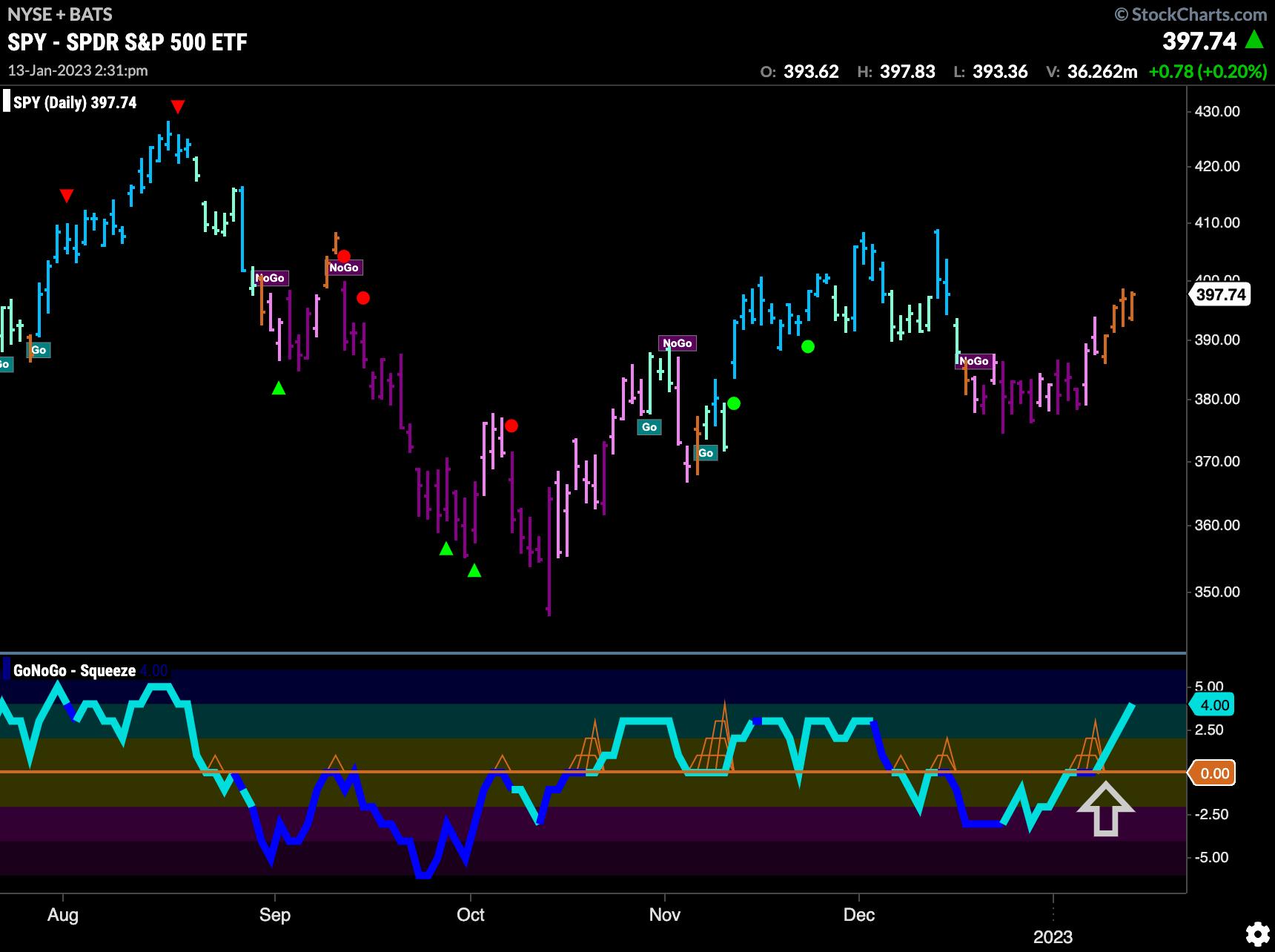
The chart below shows the $SPY with daily prices and the full suite of single security GoNoGo Indicators applied. As we can see, price has rallied this week and caused GoNoGo Trend to paint a string of amber “Go Fish” bars. In the lower panel, we see that GoNoGo Oscillator broke above the zero line, signaling that momentum had shifted away from the NoGo, and that led to the color change in price. We will look to see if GoNoGo Trend can move into “Go” bars if price goes higher.
As we zoom out and look at the weekly chart below, we see that there is the same uncertainty on the longer time frame chart. This week’s price action is causing GoNoGo Trend to paint an amber “Go Fish” bar here as well as the “NoGo” trend loses its steam. Of course, price could move lower and the indicator could revert to painting “NoGo” bars again, but we are seeing an inflection point as the market tries to set a higher low. The GoNoGo Oscillator shows that there is little directional momentum as the tug of war between buyers and sellers continues. With the oscillator stuck at the zero line, it will be important to note if this level becomes support, in which case we may see price move higher still.
Let’s turn to some GoNoGo RelMaps to understand where the performance is coming from, as we see the signs of a market moving towards a more risk-on environment. Below, we have a GoNoGo RelMap showing the Morningstar 9 style boxes. These tickers can be easily found on StockCharts. What is clear is that the outperformance of late has been from Value stocks, mostly large- and mid-cap. The top three panels here are large-, mid-, and small-cap value. The bottom three panels here are the three growth styles, again large-, mid-, and small-cap. We can see how, generally speaking, these growth styles have underperformed.
Finally, the GoNoGo Sector RelMap confirms the above, in that we can see a defensive picture in terms of the sectors within the S&P 500 that are outperforming. The growth sectors $XLK, $XLY, and $XLC are the top three panels, in that order, and you can see the “NoGo” colors mostly prevailing. The middle of the chart shows the more defensive, value, and industrial sectors such as $XLI, $XLB, $XLE, and $XLF, all painting blue “Go” bars, as well as $XLU and $XLRE. Let’s see what next week brings!
Better Charts. Better Decisions.
Alex Cole